UX Case Study
INNOVEST
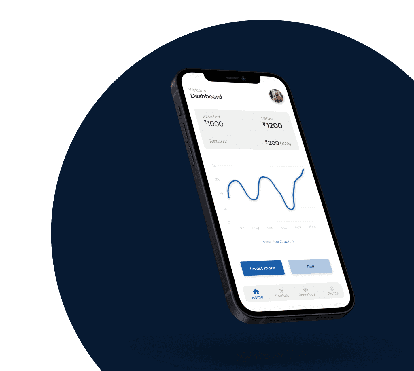
App that invests money in an innovative way
About the Project
This is a pseudo project
It was designed for my practise as a designer
Tools used
figma
Time taken
2
months
Challenge
To design an app which rounds up whenever a payment is made and invests the spare change
The overall goal of the app is to make the process of investing easier and less daunting for people
Steps of design process
1
Research
2
Planning
3
Wireframing
4
Design
5
Testing
Research
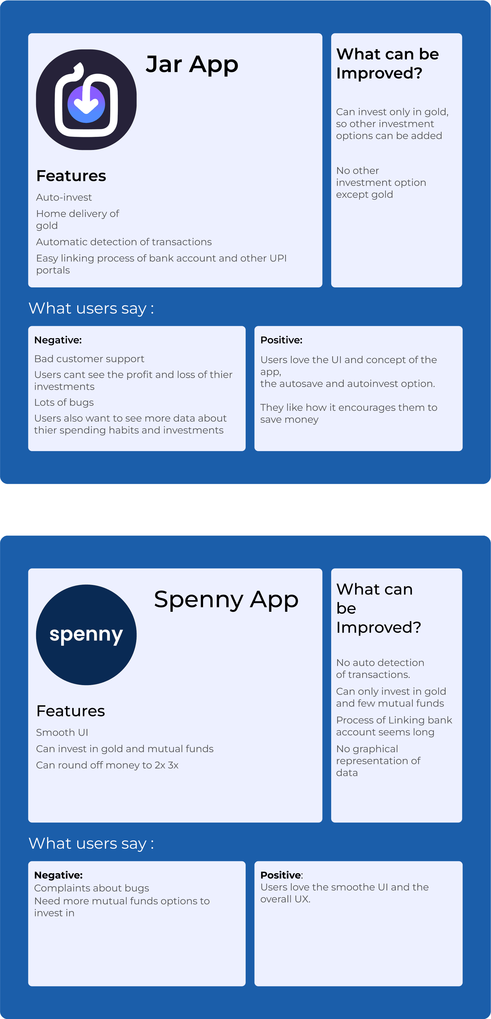
Market Research
User Journey Map
Phases
Tasks
Painpoints
Opportunities/
improvements
Downloads the app and does the kyc
downloads the app
gives his information
completes the kyc
user finds the process difficult
user is unsure about sharing personal information
make the process easy by guiding the user through it
give small hints at some places
have a trustworthy looking UI and build a trustworthy brand
Sees a advertisement about the app/ hears about it from someone
clicks on the ad to find out more about the app
searches on the internet to find out more about the app
the website looks different from compared to what was shown in the ad
can’t find out about the app on the internet easily
show on the website what was shown in the ad and include other useful info
have better SEO for the website
Linking bank account and demat account and UPI
fills the information and links the bank account
doesnt know how to link bank account
the preferred bank is not available in the list
tutorial and hints
have a wider range of banks available
Makes any payment and the amount gets rounded before deducting
user makes the payment from any methond of thier choice
the money gets rounded and deducts
no information about the rounded money
user wants to roundoff double or triple
pop-ups about the rounded off money
option to increase the roundoff to 2x, 3x and so on
The spare change after payment goes into the app wallet and gets invested
after the payment the spare change gets invested
Less investment options
no information about the invested money
Include more investing options
give confirmation after investing
have information and data about the returns in a graph format
The user can check returns, set investment goals and other things
user checks returns and other info on the app
user can set investment goals
the information of returns is not clear
user is confused
have clear representation of information
highlight the important information
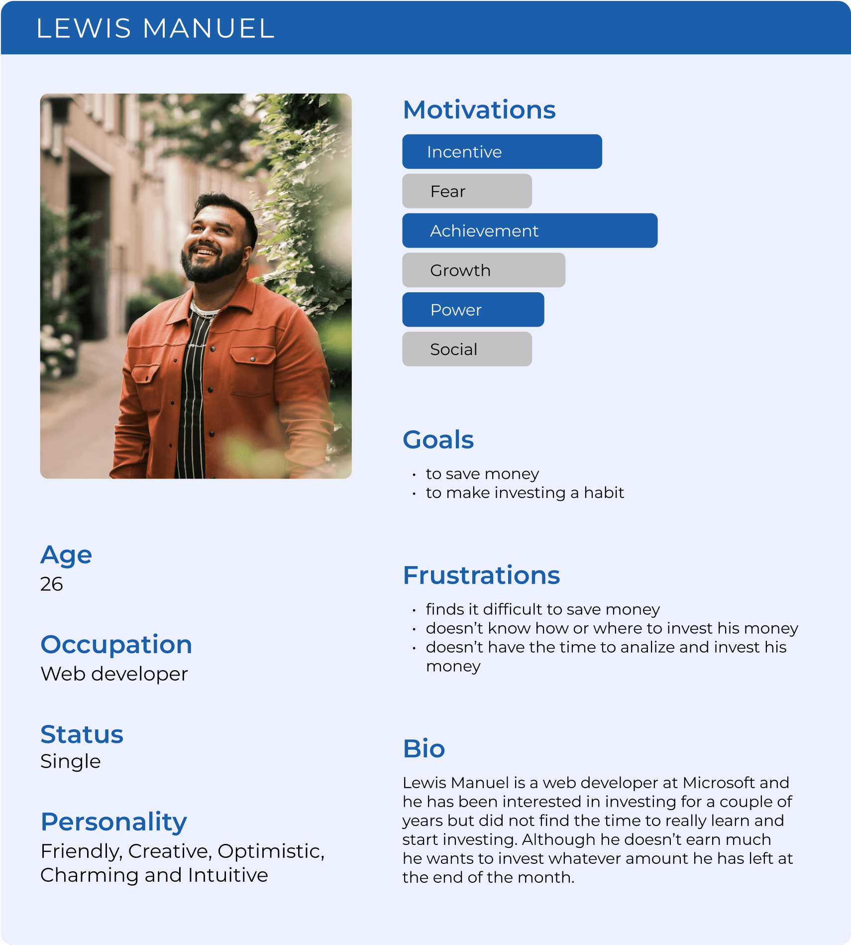
User Persona
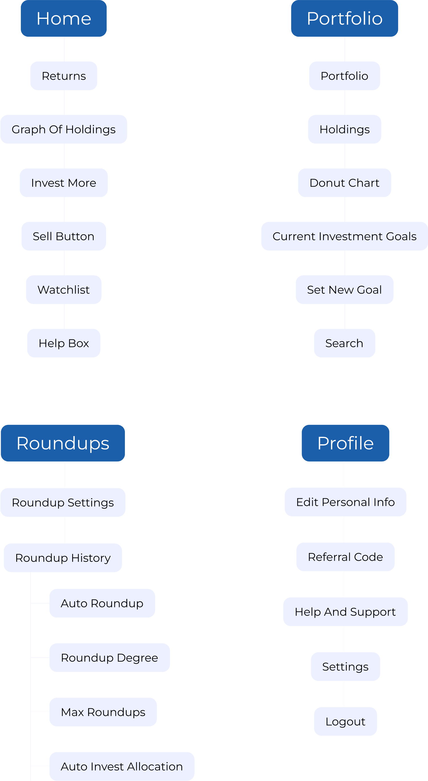
Information architecture
Wireframing
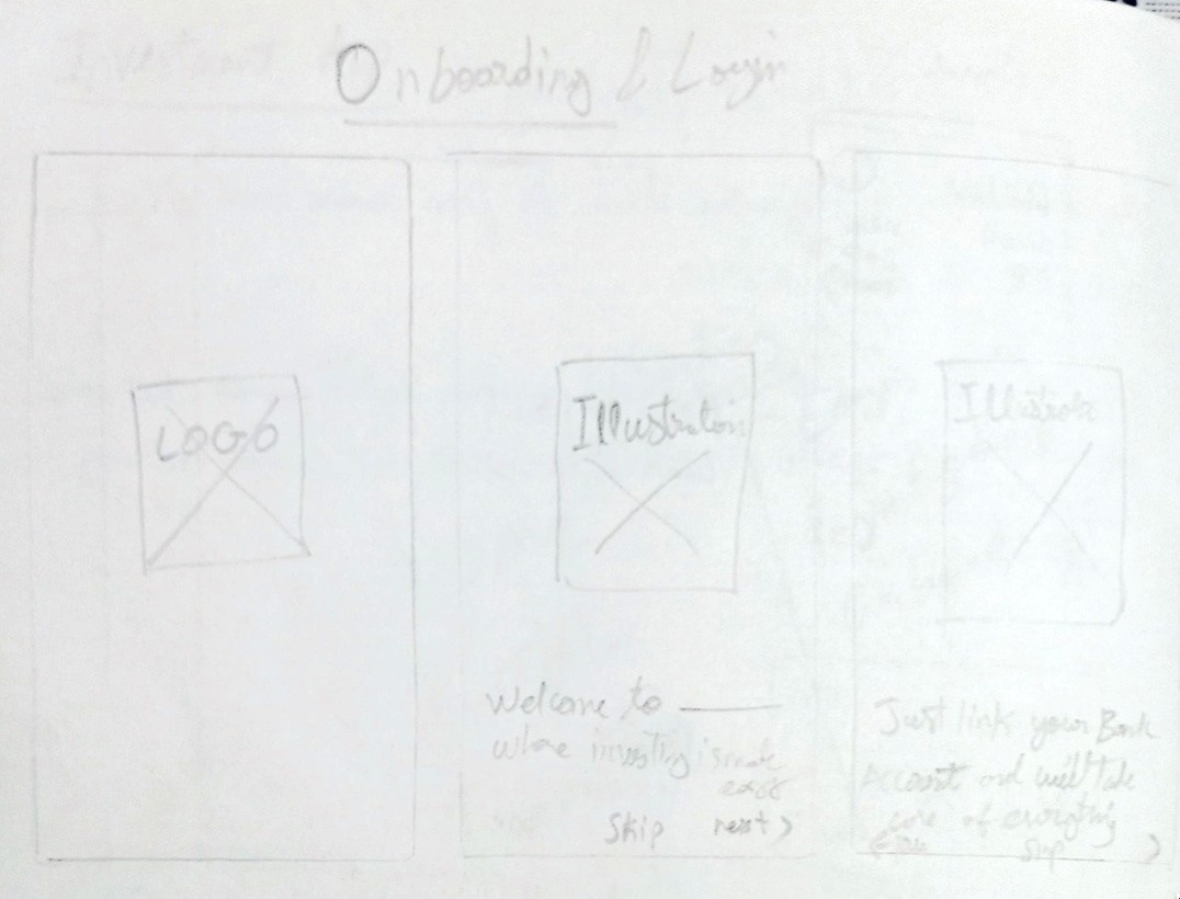
onboarding

HOME
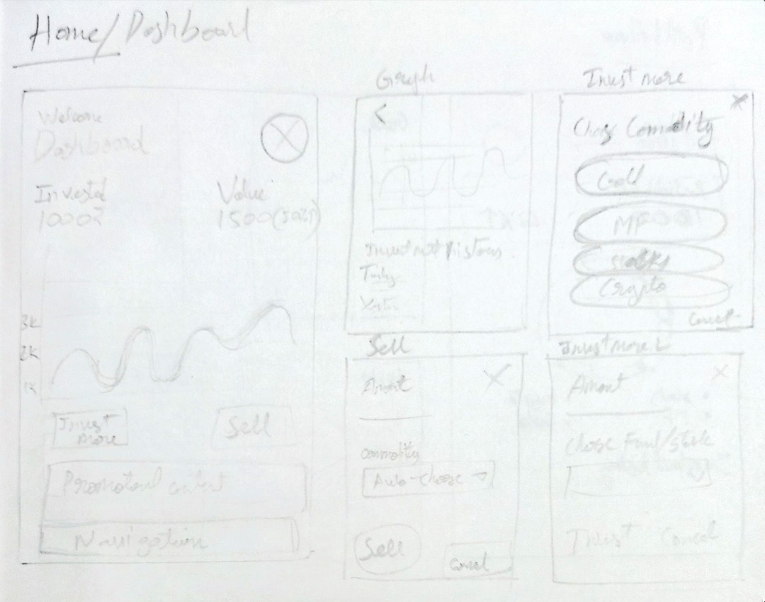
PORTFOLIO

Design Phase
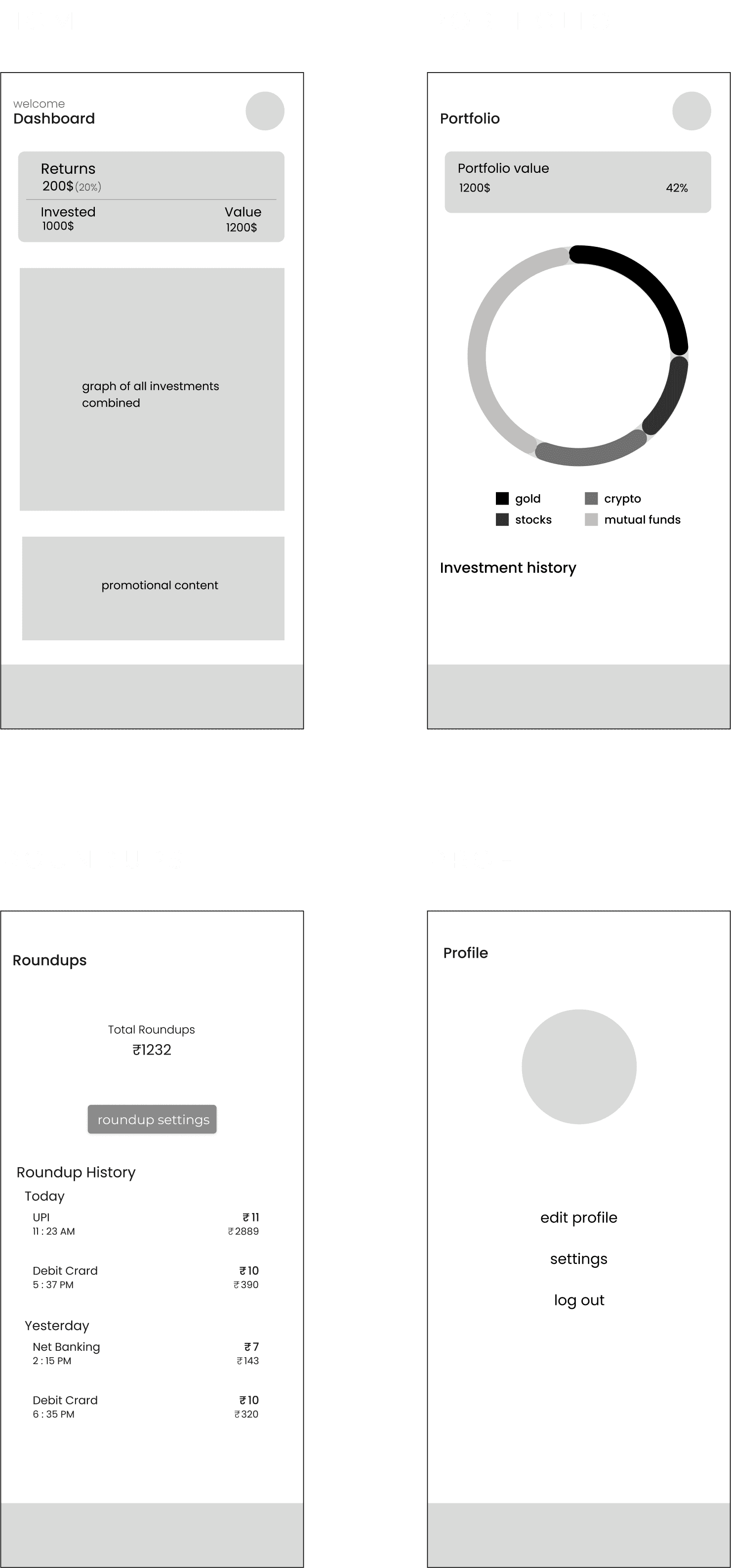
I went ahead and made the low-fidelity mockups in figma
then I used some colors and made a high fidelety mockups of the screens
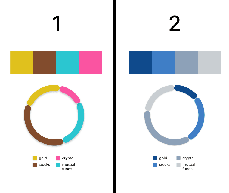
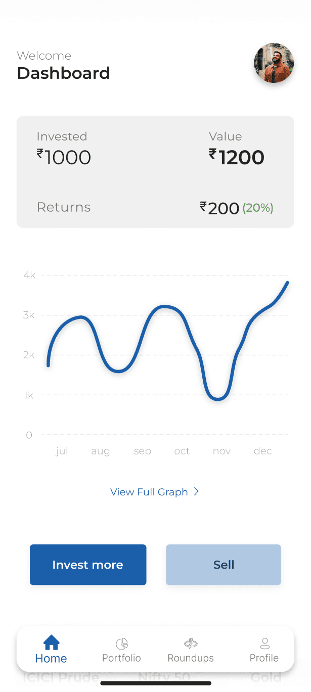
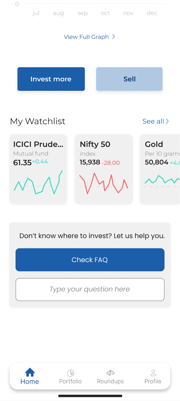
After a review with the stakeholder, I learned that the colors behind the line chart are distracting
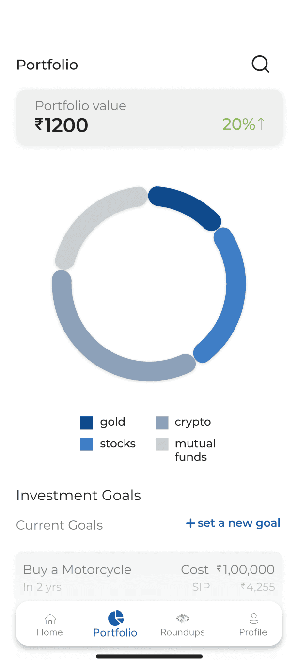
and the colours of the donut chart do the job of differentiating the categories well but they are too distracting and don’t integrate well with the app
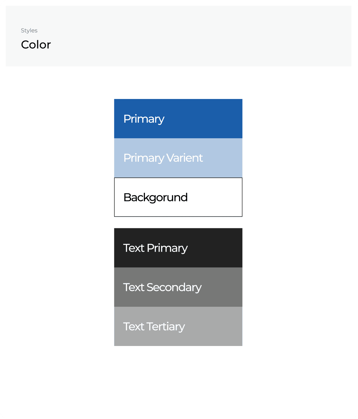
I also changed the primary colour a little bit to make it look more muted.
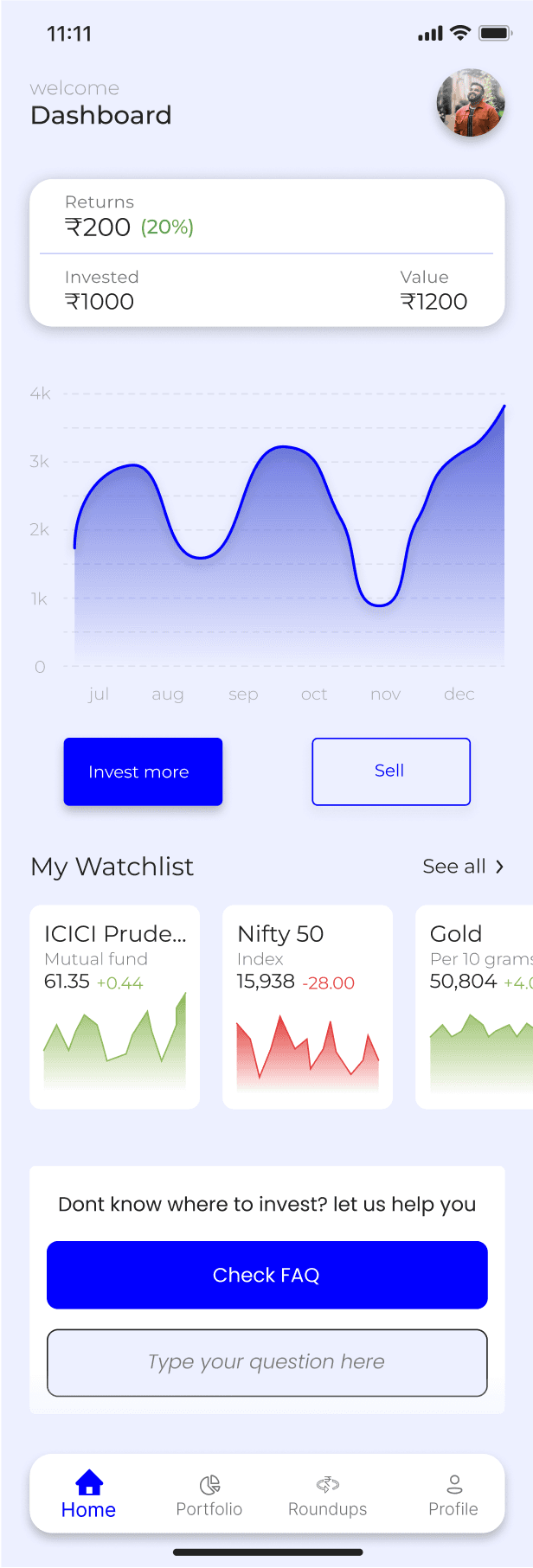
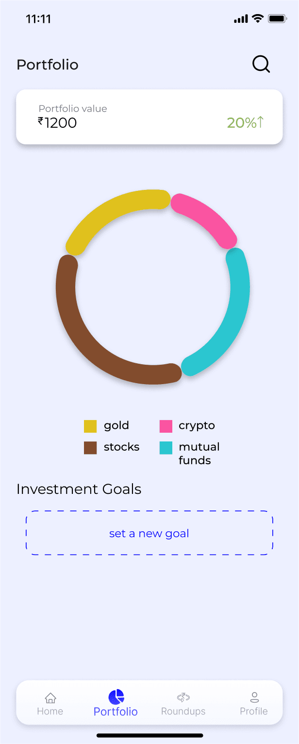
So I changed the colors of the donut chart to make it look seamless
and then I,
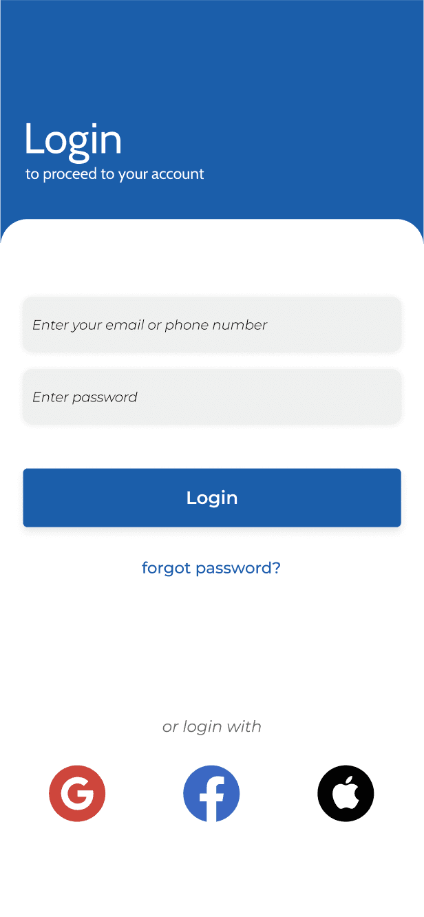
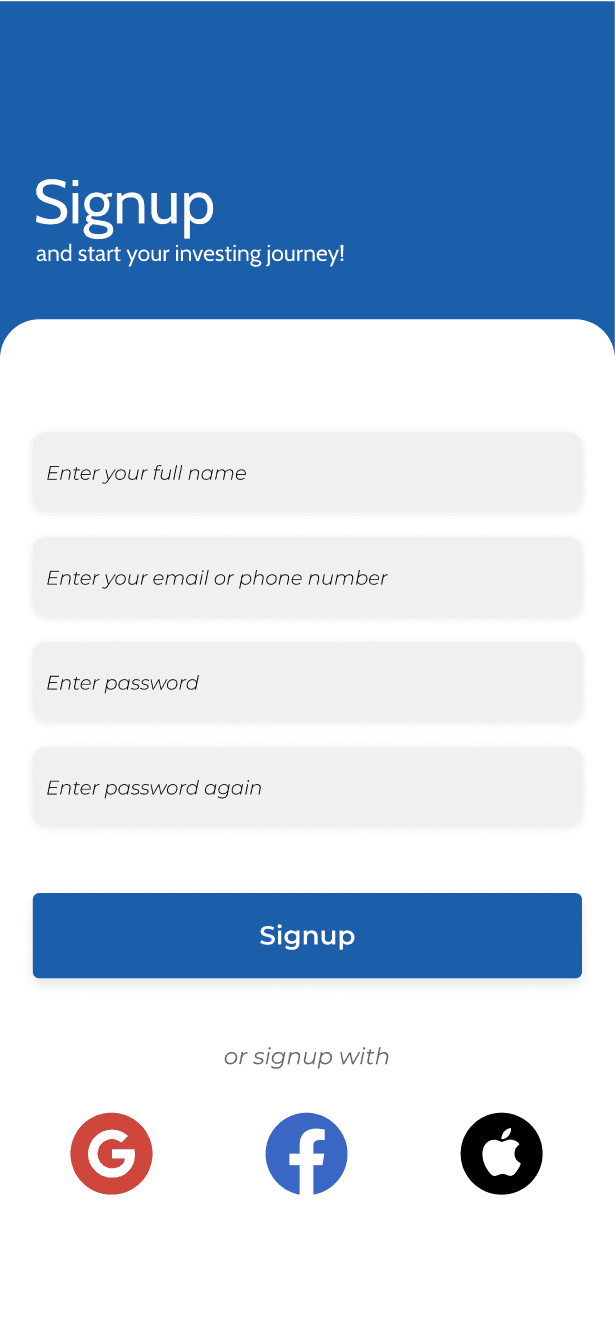
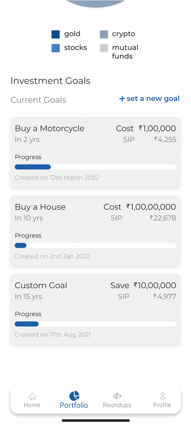
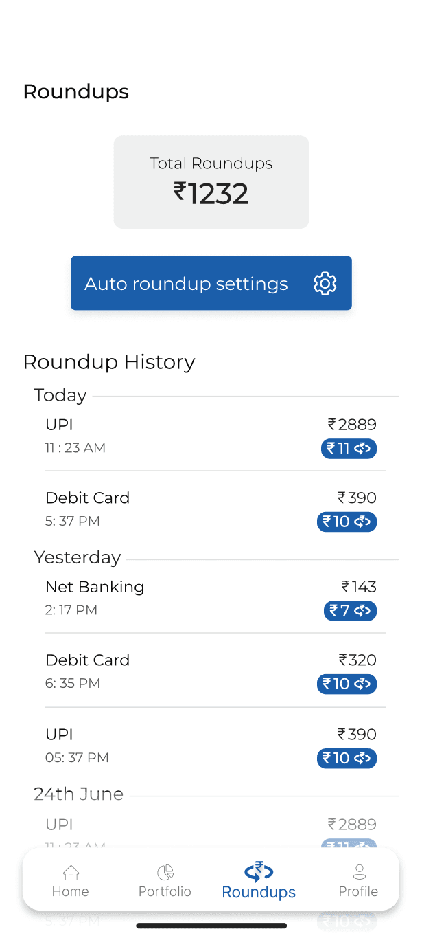
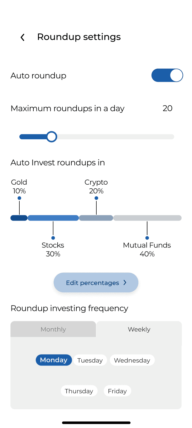
Completed the flow using the new primary color
Removed the background of the graphs
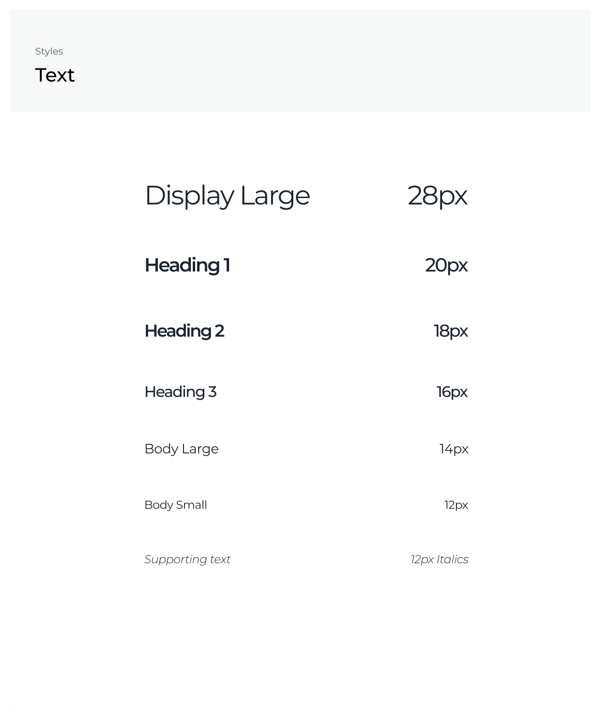
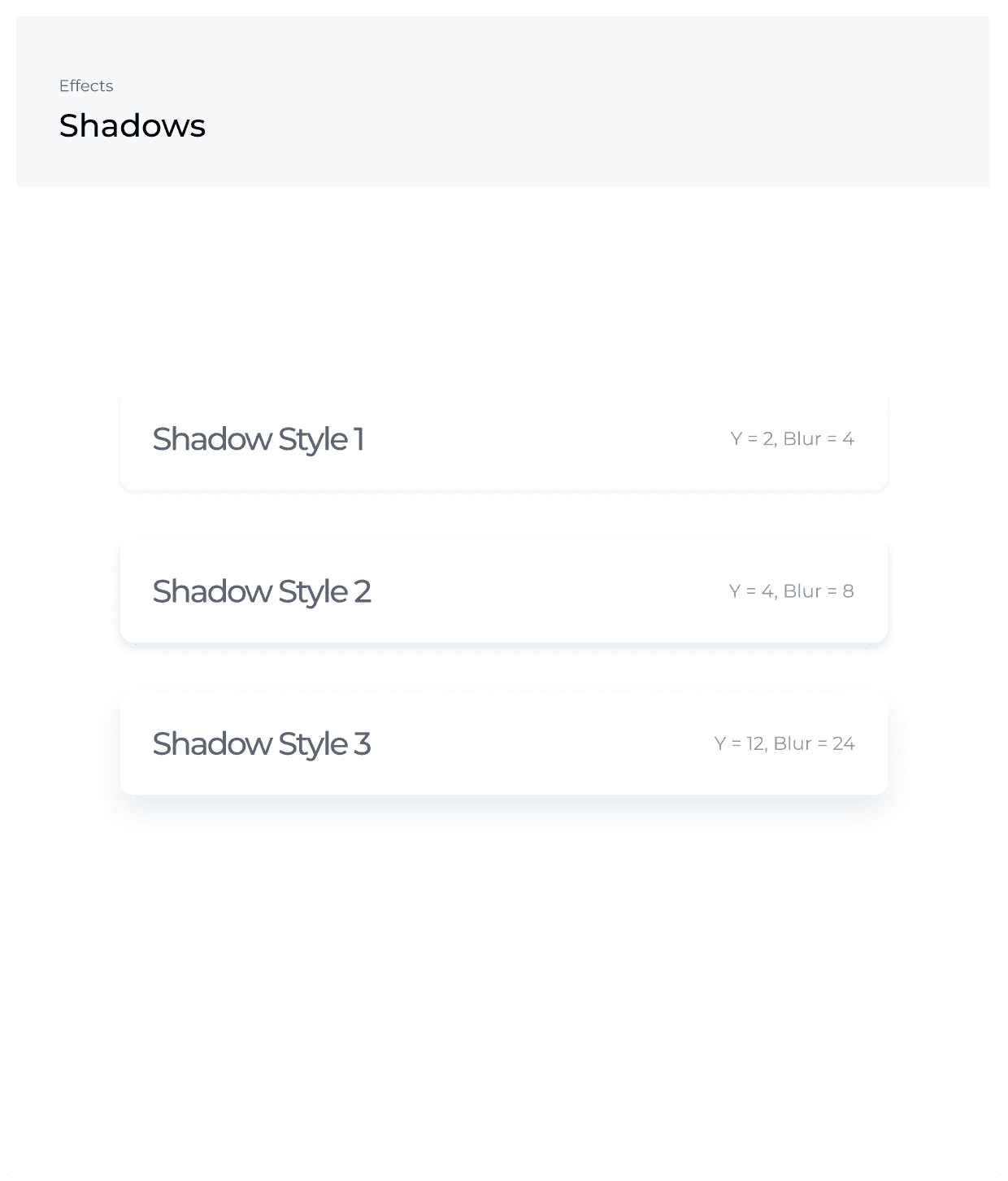
Style Guide
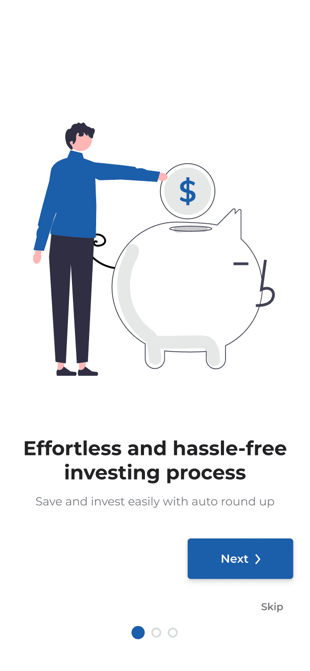
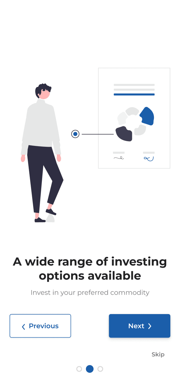
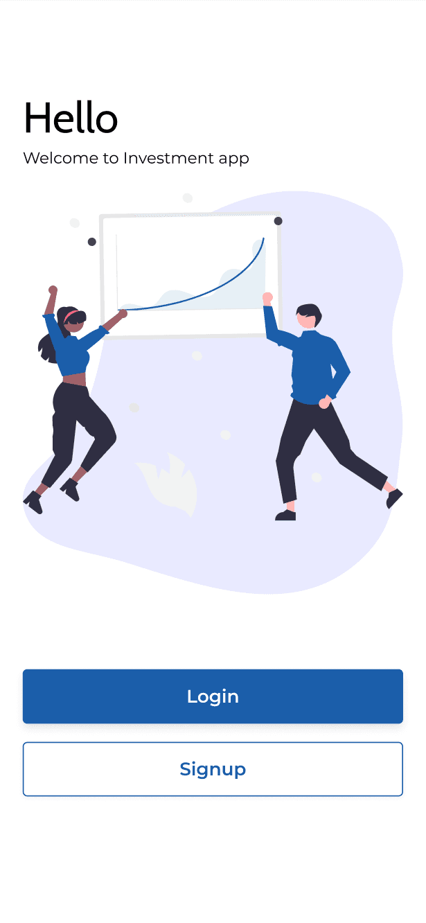
Final Design



Testing
Conclusion
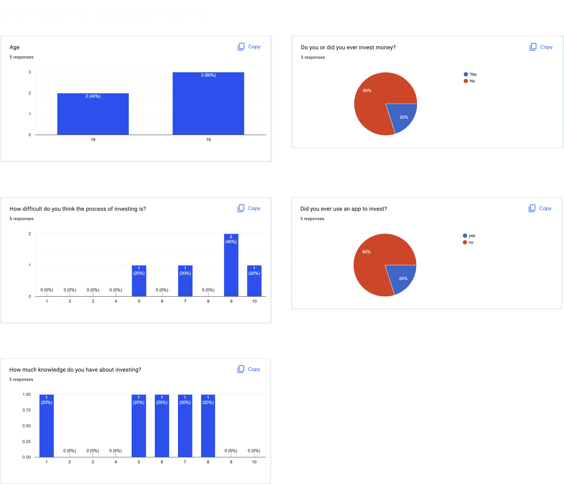
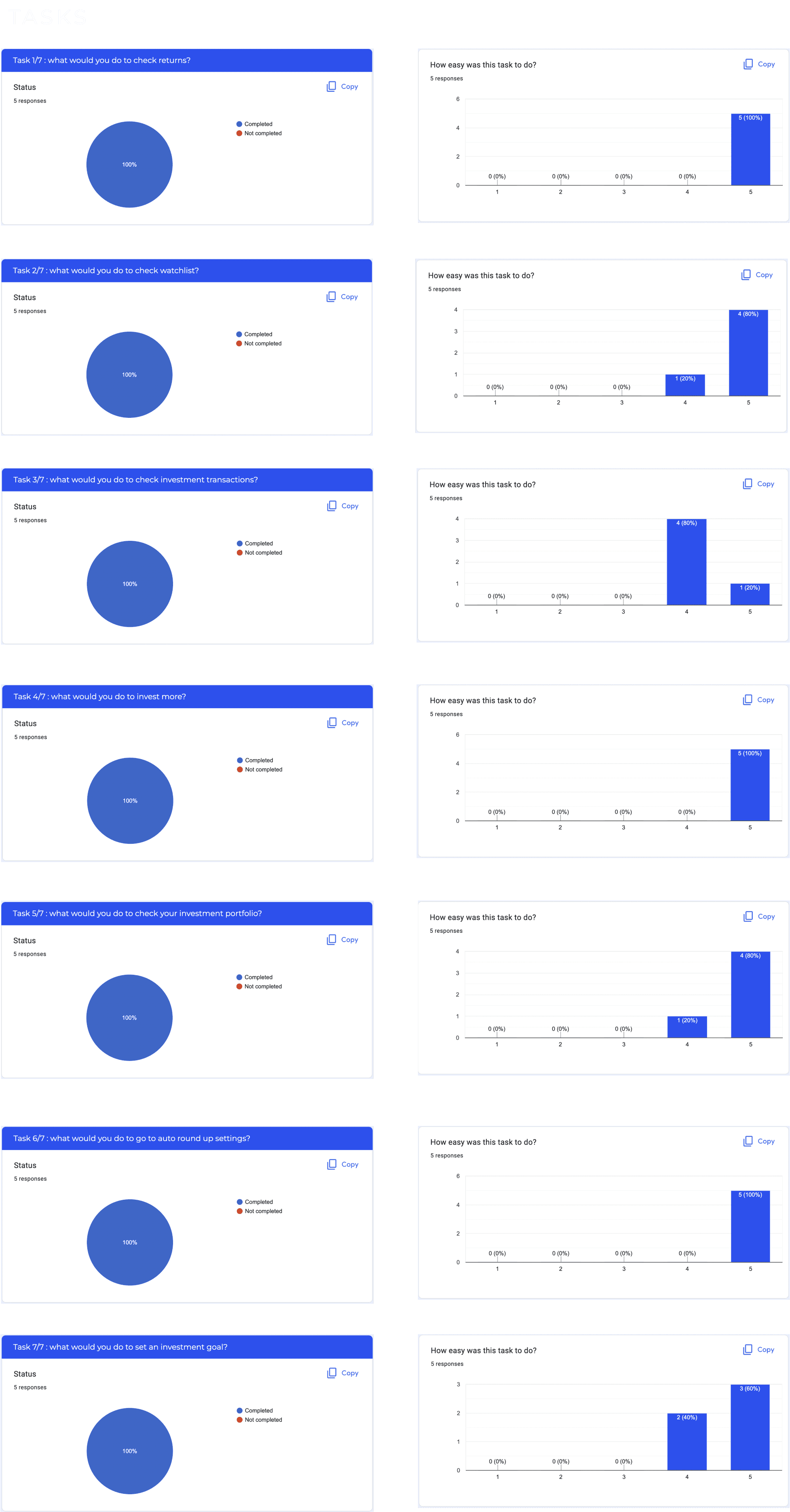
The User testing went well, with all users completing all the tasks without any major problems.
Dribble
Behance
Youtube
Designed, developed and all rights reserved by Aimann Shaik © 2023