Dribble
Behance
Youtube
Designed, developed and all rights reserved by Aimann Shaik © 2023
Student Portal Redesign
case study
About the Project
The university I study in has a web portal for students through which students can access important information related to their academics. Students can check a variety of information like course material, attendance, exam syllabus, etc. The web portal works fine and helps a lot of students by letting them access this information anywhere, anytime in a single website.
The implementation of this portal by my university is of great help to all the students but it has some problems with the UX. It took me just one try to see how bad the website’s design was. Even though students get the hang of it after using it a few times, they still run into problems. So, I decided to step in and use what I’ve learned about design to make the website easier to use for everyone at the university.
My Role
I was the only designer who worked on this. I conducted the research sessions, designed wireframes and prototypes and also did some user testing to check the feasibility of the designs.
The Redesign
Research
To design for students, we must first find out what the users really want. As a designer it is important to understand the user’s needs. So that’s what I did, I made a google form and had a few questions related to the student portal on it.
I found out what were the biggest problems of the users, what were the main things that users use on the website and how frequently they use it.
Here are the results of the research
Q1. “What are the main tasks you perform on the student portal?”
Checking Attendance Percentage
Checking Grades
Downloading Important Documents
Checking Notices
Q2. “How often do you use the website?”
Multiple times a day
Once a day
Once every couple of days
Once a week
As we can see 50% of the people use the portal multiple times in a day and 75% of the users use the portal at least once in a day.
So providing them with the information they require as soon as possible is essential.
Planning
After getting an insight into the problems of the existing website, I went ahead planned for potential solutions.
The first problem was a cluttered and overwhelming navigation menu. So I simplified it, removed redundant elements and made it much shorter
Information Architecture - Before
Documents
always empty and useless
Announcements
Notice Board
make one single section for
announcements and notices
add a search and filter, filter by date etc
Feedback
on curriculum
included in academics
My Info
Upload Photo
Profile Video
Transfer Certifiate
Migration Cerfificate
Contact
Upload Resume
Profile
Personal Data Form
Medical Record
Family Doctor
My Resume
Permananet Address
Present Address
Mailing Address
Local Address
Bank A/C Details
my info hostler or day scholar option
if hostler all hostler details - room no,
mess card and all other stuff
if day scholar then transport and any
other information
Fee
Fee Structure
My Fee Schedule
Receipts
Statment
PDC's
Refund
Mess Billing
Payments
make it look like a fee dashboard
have how much fee paid, how much is left
in a graphical way
and also tabular way
Academic
Mentor
Registration
Course Registered
Course Registered (All)
My Faculty
Onlin Classes Link
Resources
Attendance %
Attendance
Attendance Subject Wise
Continual Evaluation (CP)
Cont. Evaluation Online
Continual Evaluation (NCP)
Exam Schedule
Grade List
Online Exam
Suggested Aswers
Electives
remove unnecessary and repeated sections
condense the information into a denser structure
one section for course registered registration
attendance % and attendance
grades marks and CP NCP bs can all be in
one section exams
Hall ticket
hall ticket included in exams section
Help Desk
Complaints
Leave Form (Hosteler)
Certificate(s)
Issues
Transport Requsition
Room Shift
Room Vacate
No Due Certificate
Luggage Form
Transport
routes
transport included in my info
Activities
Assignments
Exam
included in exams
Resources
Links
Documents
included in academics
Downloads
Grade Sheet (Download)
Provisional Certificate
included in exams
Library
Library Info.
Resources
included in academics
IIC
Guidelines
News & Events
Externship
Intership
Upload Resume
Change Password
included in my info
Information Architecture - After
Dashboard
Attendance graph
new files/documents
up coming deadlines assignments
upcoming exams
notices and announcements
new uploaded documents and faster way to access documents
Academics
Course registered
My Faculty
Online Class Links
Assignments
Attendance
Resources( dcouments, links)
library
Feedback
Notices/Announcements
Exams
Hall Ticket
Exam Schedule
Online Exams
Answer Keys
Grades
IIC
Guidelines
News & Events
Externship
Intership
Upload Resume
Help Desk
Complaints
Leave Form (Hosteler)
Certificate(s)
Issues
Transport Requsition
Room Shift
Room Vacate
No Due Certificate
Luggage Form
My info
personal details
fee details
resume
medical record
bank a/c details
Certificates
Transport
hostel details
change passoword
logout
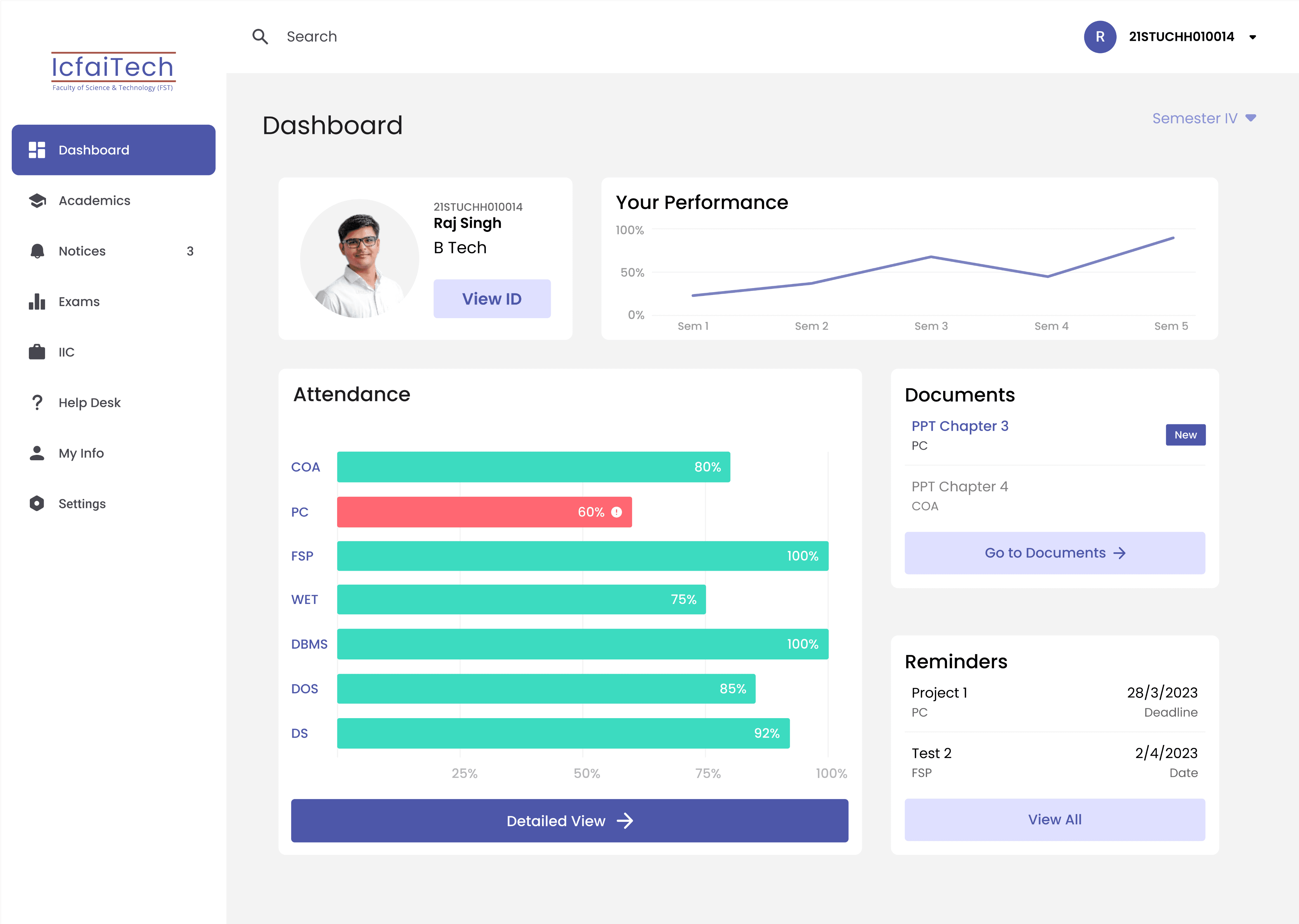
Then I planned what to include in the dashboard page so that the user can have a quick access to the things needed by them the most
Dashboard
Navigation
Attendance Graph
Notices
Documents
Searchbox
Wireframing
After the planning I quickly made a rough design to get an idea of how the interface could look like.

Design
After I made the wireframe I started the design process. I used the colours from the logo of my college and I made the design. I included a timetable section in the dashboard and made a design.
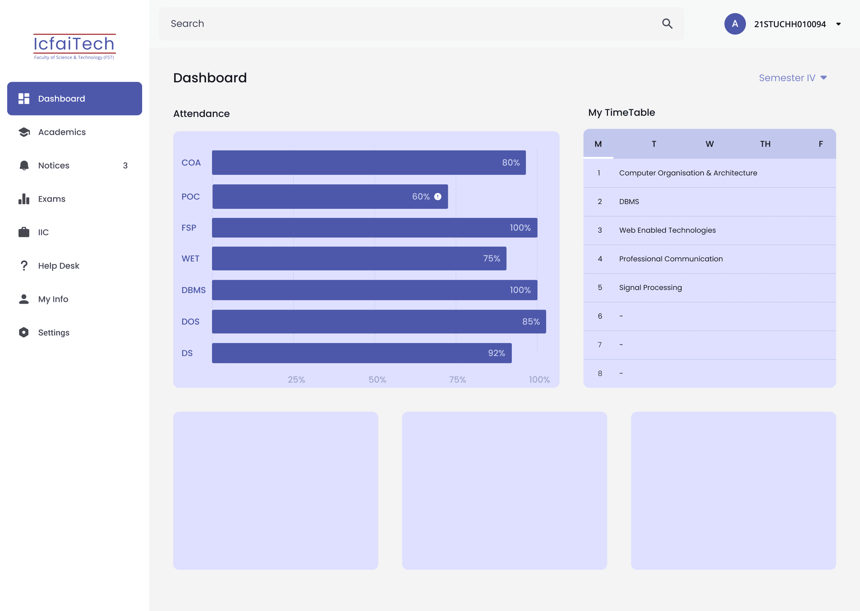
Later I performed a user test where the users didn’t really like the colour of the interface so I made some changes to the colors and modified it a litte bit.
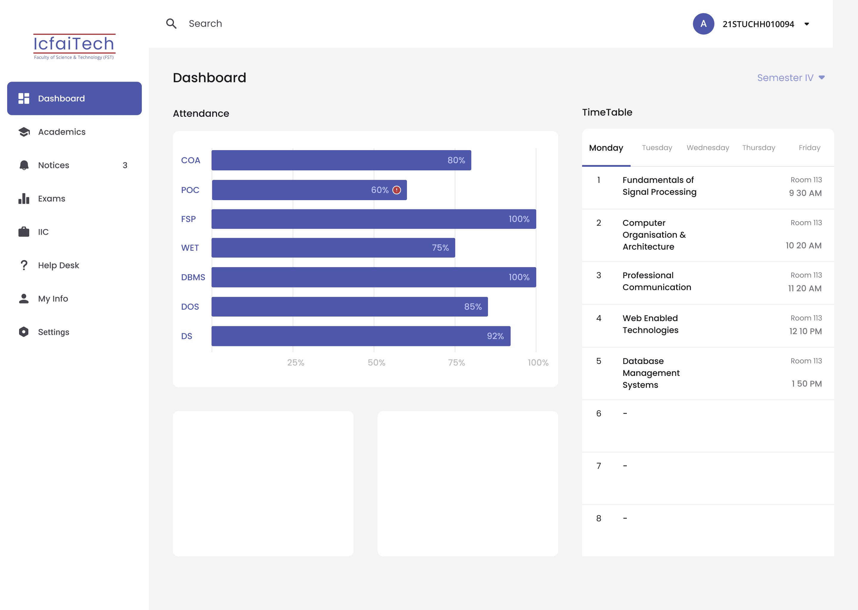
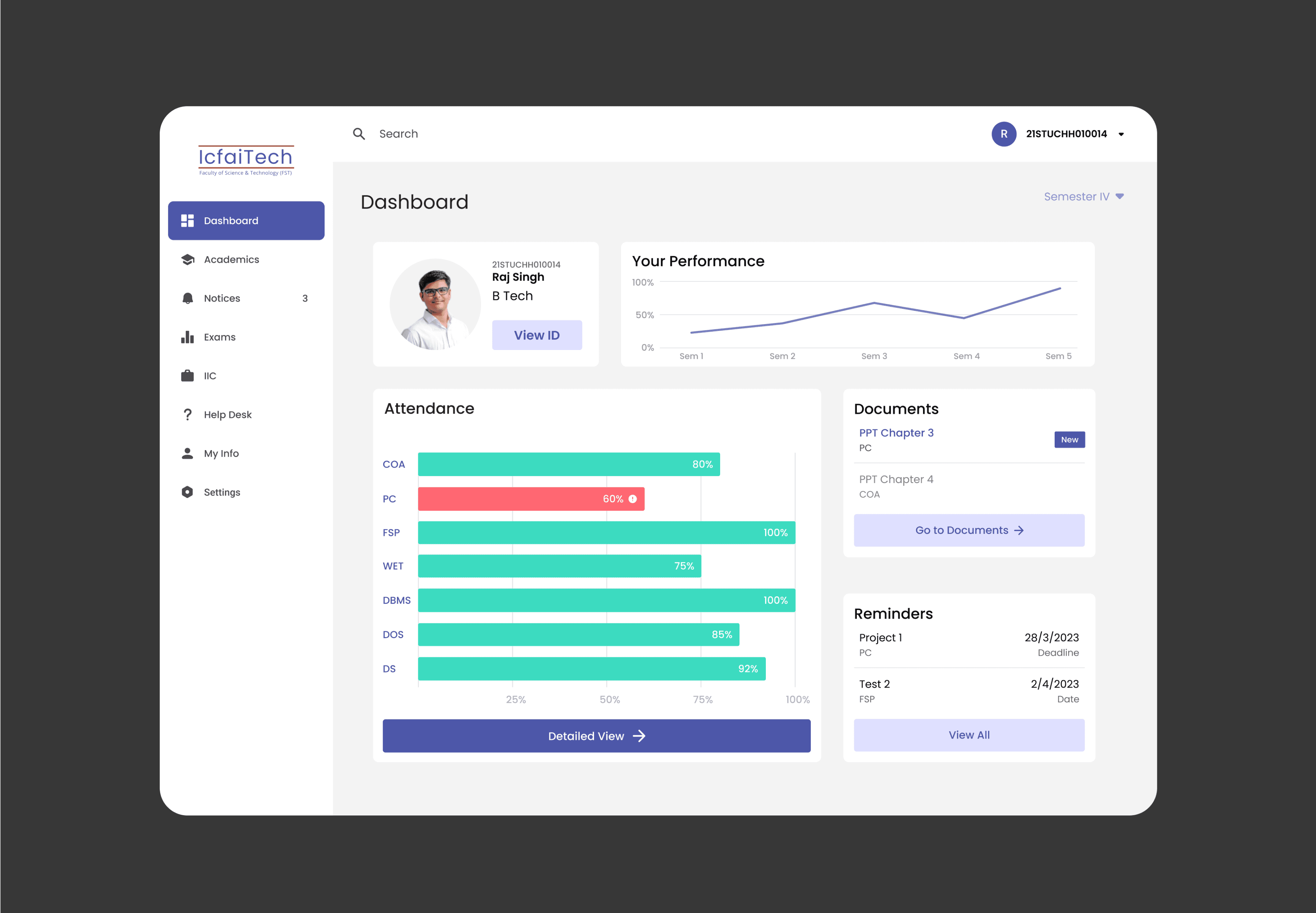
I performed another user test after this version and found out that by just percentages it is difficult for the user to understand if their attendance is below 75%.
So I changed the graph, added red colour for the the ones below 75% and green for the for the ones above 75% and I removed the time table section because the users didn’t really require that in the dashboard.
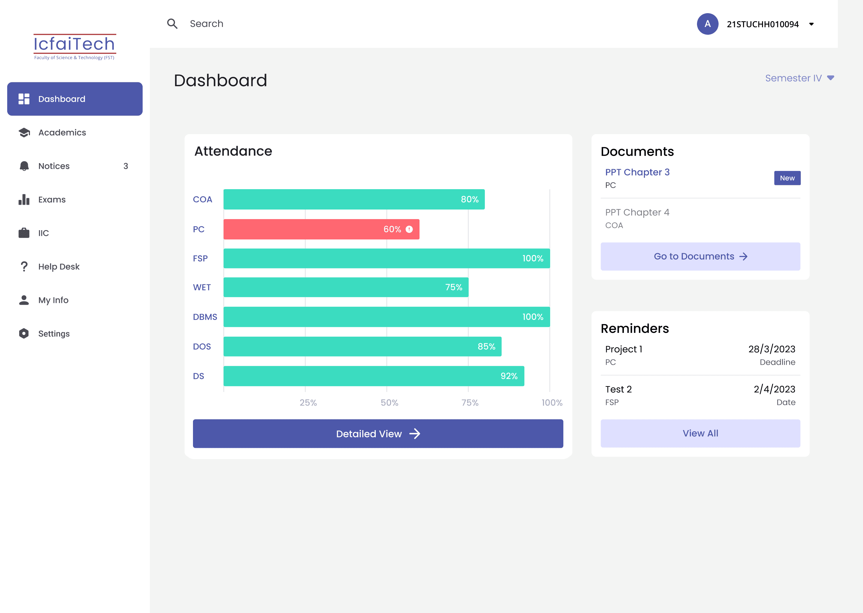
After this I added a small profile section and a progress tracking graph, so that the user can have a complete overview of their progress.
Testing
After designing all the screens I tested the design again with some of my friends as the users, they performed a few tasks and the test was successful with no problems. All the users performed the tasks with ease.
Aimann Shaik
Work
Resume
Contact