
Elevating My University’s Student Portal
Experience
case study
Overview
About the Project
The university I study in has a web portal for students through which students can access important information related to their academics. Students can check a variety of information like course material, attendance, exam syllabus, etc. The web portal works fine and helps a lot of students by letting them access this information anywhere, anytime in a single website.
The implementation of this portal by my university is of great help to all the students but it has some problems with the UX. It took me just one try to see how bad the website’s design was. Even though students get the hang of it after using it a few times, they still run into problems. So, I decided to step in and use what I’ve learned about design to make the website easier to use for everyone at the university.
My Role
I was the only designer who worked on this. I conducted the research sessions, designed wireframes and prototypes and also did some user testing to check the feasibility of the designs.
The Redesign
User Research
I use the student portal at least once a week and I myself experience these problems. But as I was designing for the students of the university, I wanted some more data from the students. So, I wrote some questions to understand what problems they face with the student portal and I created a google form with those questions and sent it to my friends from the university.
After taking a look at their responses, these were the insights I gathered.
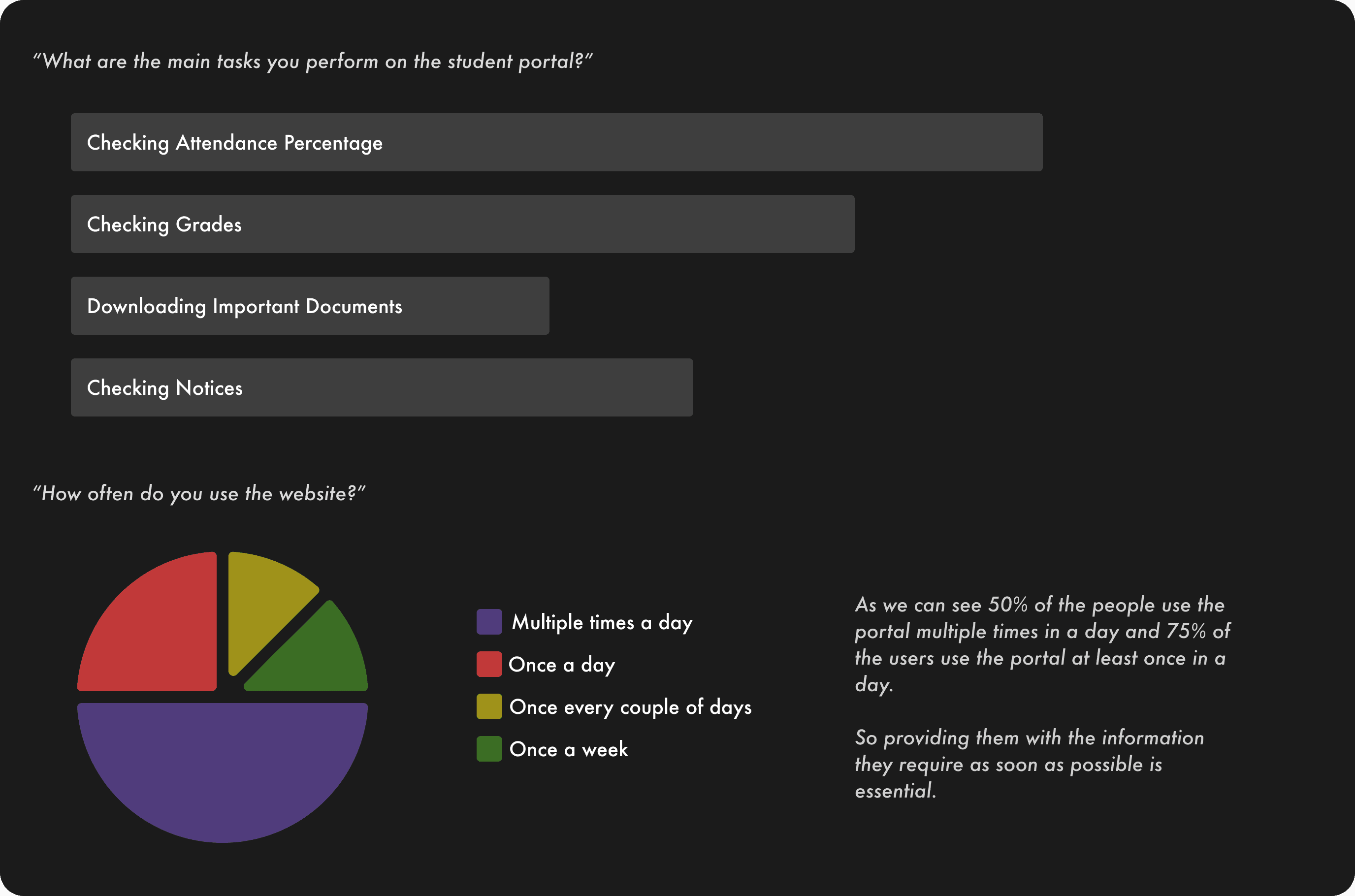
The main problems found after the research were
Tasks are time taking
Information is not organised properly
Lack of graphical representation of data
Outdated UI
Ideating Solutions and Wire-framing
Redesigning the Information Architecture
The web portal has a complex information architecture which confuses the user, it makes it hard for the user to find something and then also remembering where it is. So, restructuring the information architecture while keeping most of it similar to the previous one would help the users quickly find whatever they want. I think in most redesigns people change the complete structure off the application which makes users even more confused. Keeping the interface familiar is necessary for user satisfaction.
Redesigning the IA using the data obtained from research. The data shows that the most important info for users is attendance, grades, documents and notices. So keeping the design user-centric and also keeping it as familiar as possible, you can see how it was before and what I came up with.
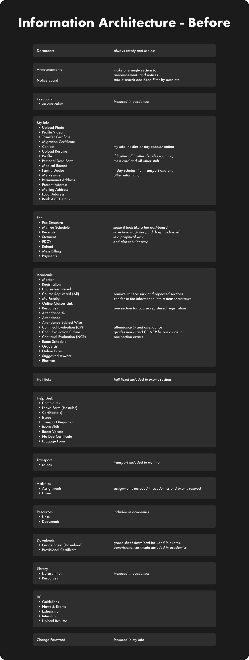
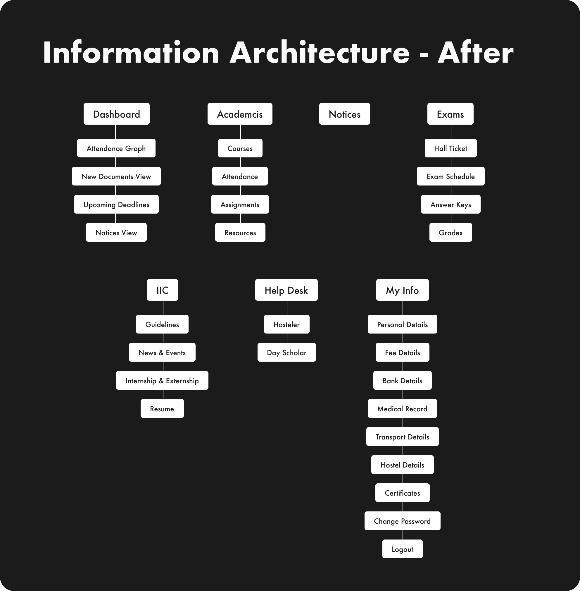
Comparing with the previous version, we can see that redundant elements have been removed or merged into one. Some separate pages have been combined into one page with distinct sections.
i. The Documents section remains consistently empty.
ii. There used to be two sections called Notices and Announcements, but their content was identical. Hence, I’ve merged them into a single section.
iii. The My Info section contains numerous options, which could be organised as sections within a single page.
iv. The entire Fee section can now be integrated within the My Info section.
v. Similarly, the Academics section also offers a variety of options. Several separate pages can be consolidated into different views within a single page. This way, users can easily select the page they wish to access.
vi. I’ve created a new Exam section to encompass the Hall Ticket. Additionally, related pages such as Exam Schedule and Grades can also be included in this new section.
vii. The Activities section had two subsections — Assignments and Exams. It seemed unnecessary to maintain separate sections for these, so I’ve integrated
viii. Assignments into the Academics section. Meanwhile, the existing Exams page now resides within its own section.
ix. The Resources section has been folded into the Academics section.
x. Within the Downloads section, there are two options — Download Grade Sheet and Provisional Certificate. I’ve included the Download Grade sheet option within the Grades page and the Provisional Certificate option within the Academics section.
xi. The Library is now part of the Academics section.
xii. As for IIC, no changes have been made.
xiii. Finally, I’ve moved the Change Password section to the My Info section, treating it as a subsection of that page.
2. Adding a Dashboard
During the research, I discovered that the most frequently accessed sections and features on the website were attendance, grades, documents, and notices. However, some of these were nested within other sections, causing users to struggle during their search and increasing their frustration.
To address this, I introduced a dashboard section featuring essential items, providing users with a quick overview.
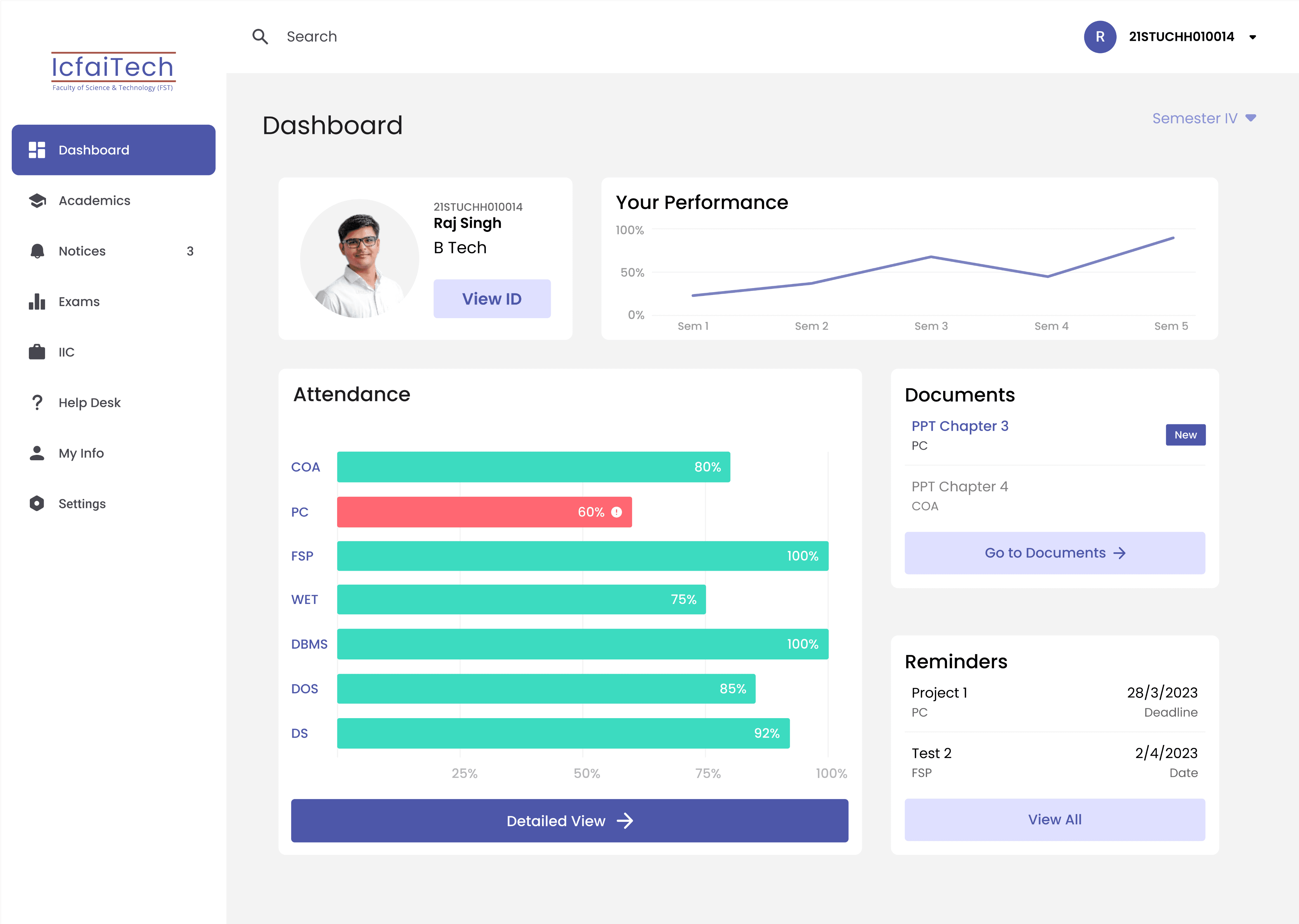
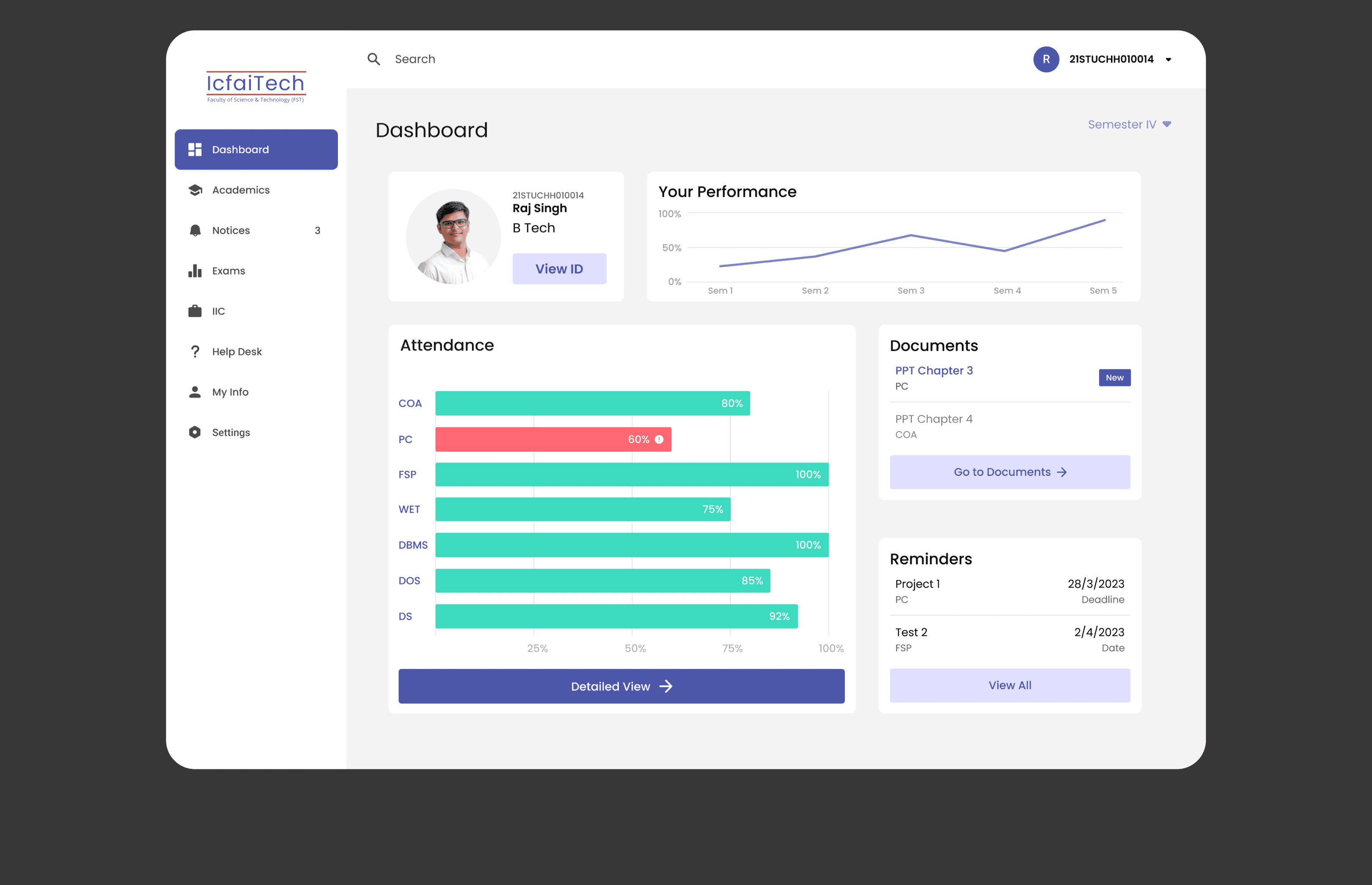
The focal point of this dashboard was the attendance view. Previously, attendance data was presented in a tabular format. To make this data easy to comprehend, I transformed this information into a graphical representation. Given that the university mandates a minimum attendance requirement of 75% for all courses, I used colours to indicate whether a course’s attendance exceeded or fell below this threshold.
Recognising the significance of the documents feature, I designed a compact card displaying the most recently uploaded resources. Additionally, I included a button that seamlessly navigates users to the documents page.
To assist users in managing their assignments and upcoming tests, I integrated a reminders card. This card serves as a helpful reminder of deadlines, complete with a ‘View All’ button that conveniently directs users to the Reminders page.
At the top of the page, a progress tracker was introduced to enable users to monitor their academic progress relative to previous semesters.
Furthermore, since the student portal functions as an identification card for accessing the university campus, I integrated a card displaying key personal details along with a ‘View ID’ button.
Regarding grades, while they are undoubtedly vital, users typically check them after examinations are completed. Thus, I determined that it wasn’t necessary to feature grades on the dashboard page.
I executed all of these enhancements with a clean and minimalist user interface. The navigation bar maintains a simplistic appearance, ensuring that each webpage appears uncluttered and that information is readily comprehensible. This approach starkly contrasts with the prior design, which tended to overwhelm users with its complexity.
These were the previous iterations of the dashboard section design

After this I applied the same design theme to all the pages and updated the UI.
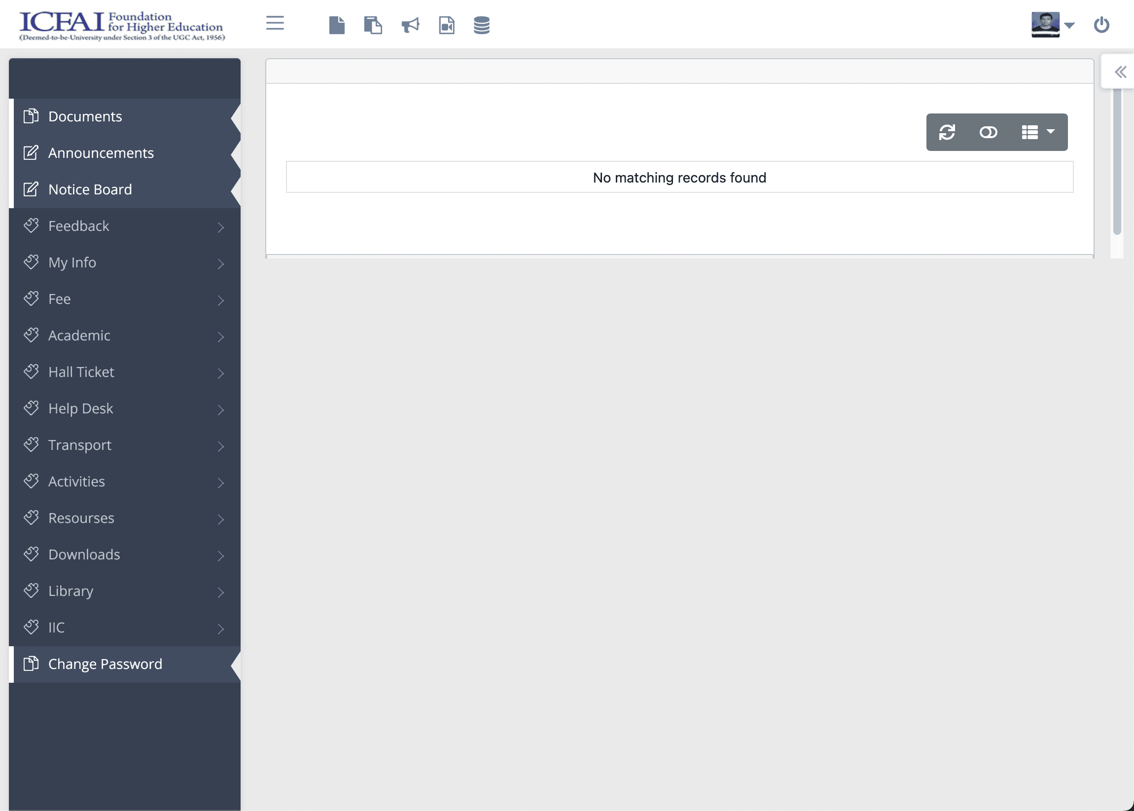
Main Screen
Before
Main Screen
After
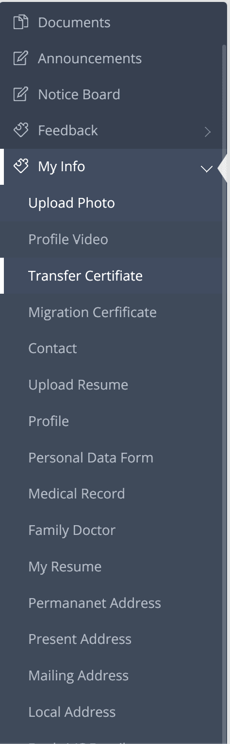

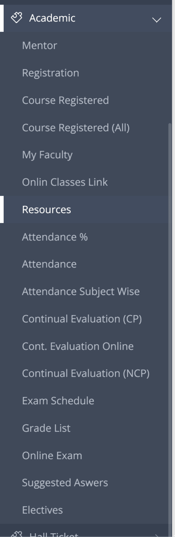
Navigation
Before
IcfaiTech
Faculty of Science & Technology (FST)
Dashboard
Academics
Notices
3
Exams
IIC
Help Desk
My Info
Settings
IcfaiTech
Faculty of Science & Technology (FST)
Dashboard
Academics
Courses
Attendance
Assignments
Resources
Notices
3
Exams
IIC
Help Desk
My Info
Settings
IcfaiTech
Faculty of Science & Technology (FST)
Dashboard
Academics
Notices
3
Exams
Hall Ticket
Exam Schedule
Answer Keys
Grades & Marks
IIC
Help Desk
My Info
Settings
Navigation
After
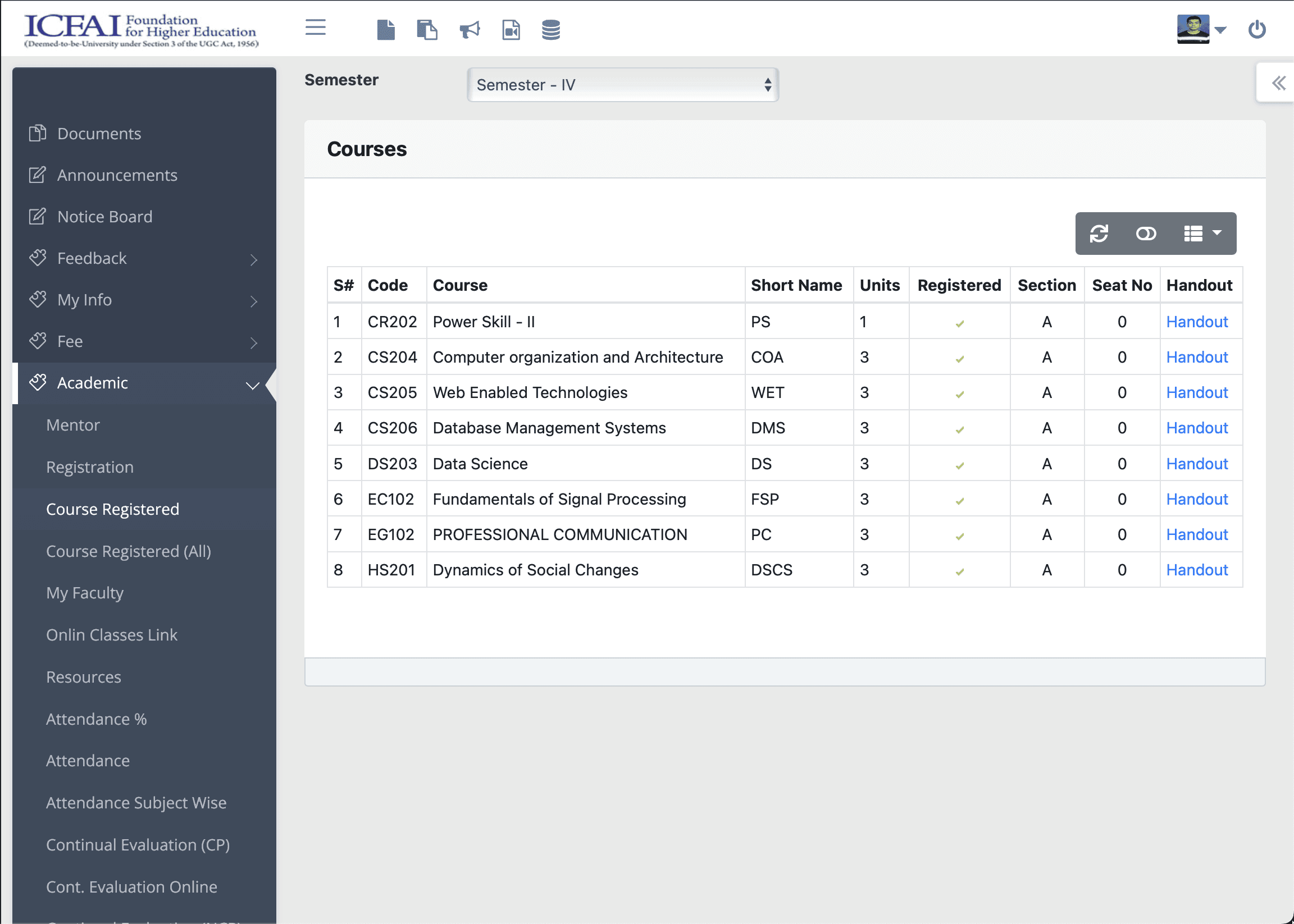
Courses Screen
Before

Courses Screen
After
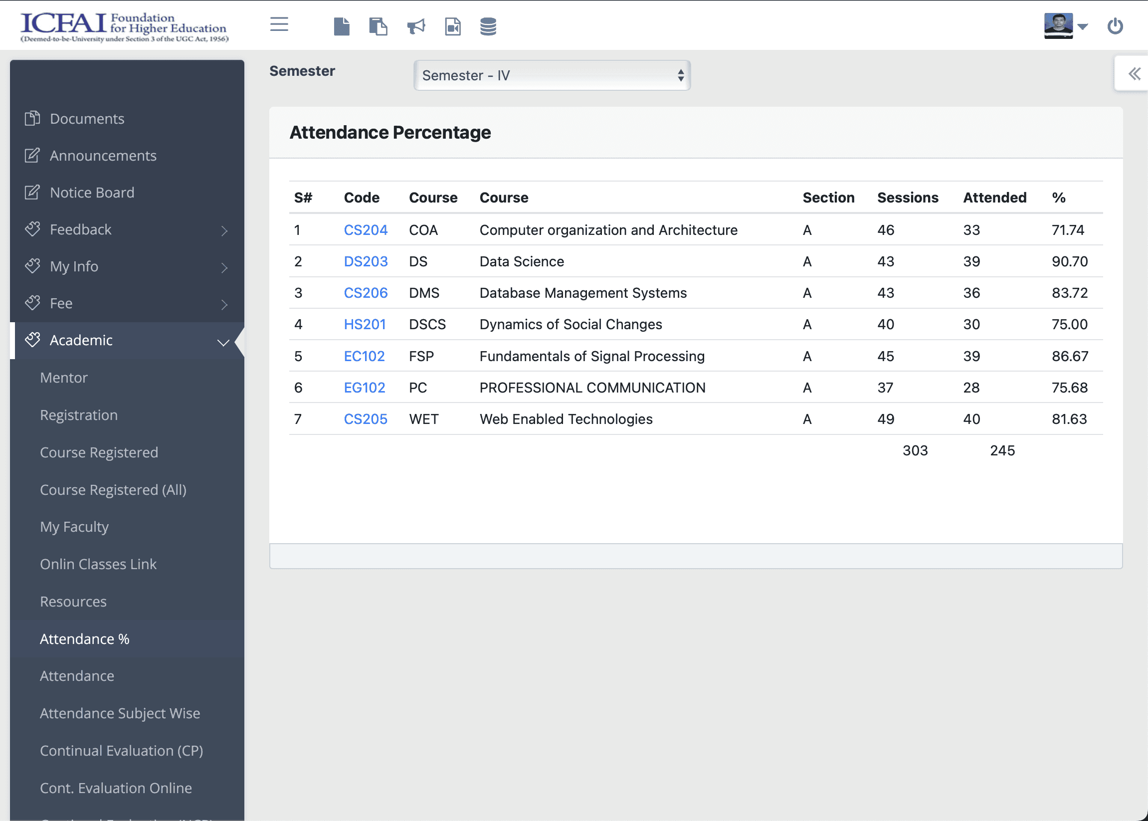
Attendance Screen
Before
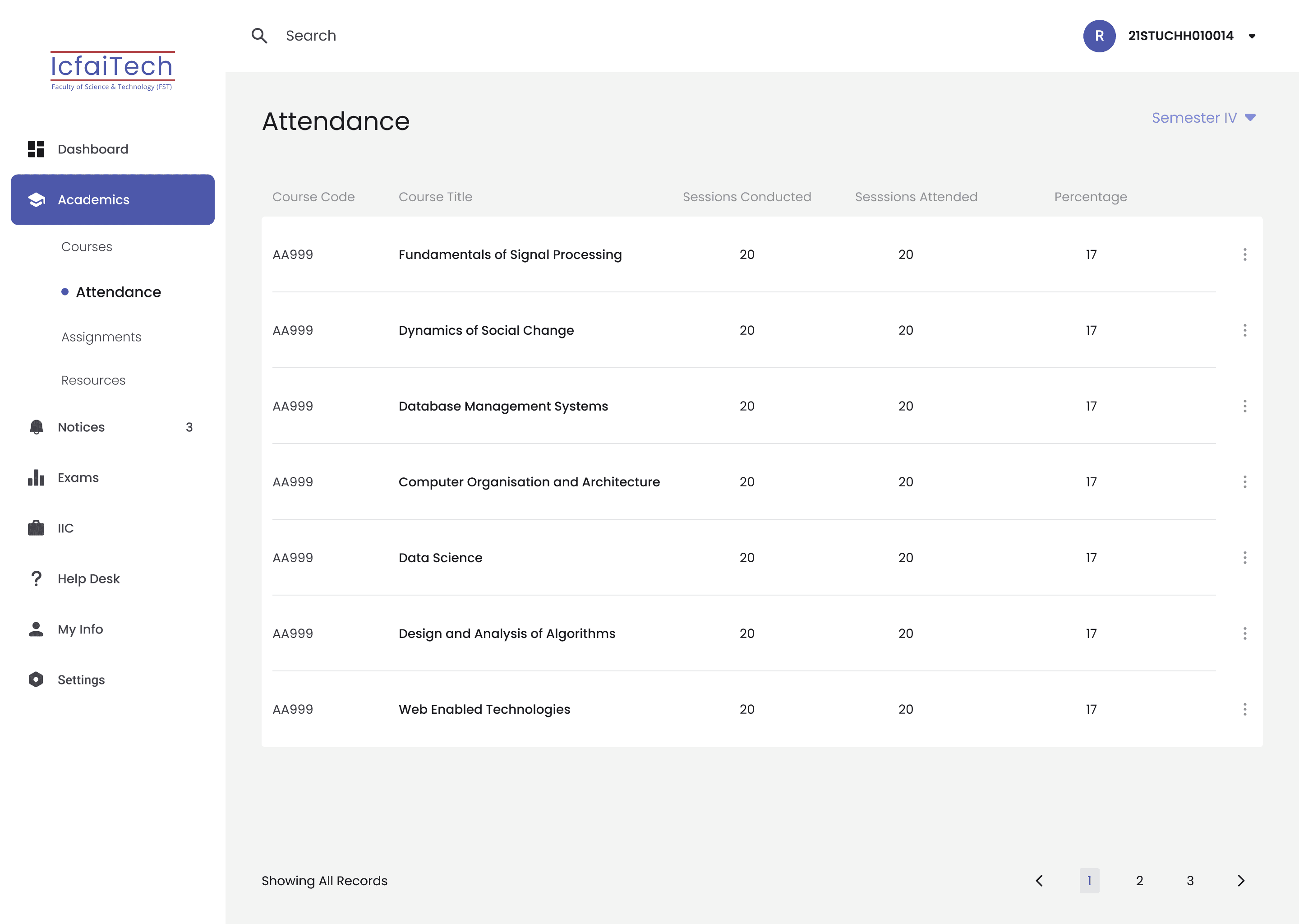
Attendance Screen
After
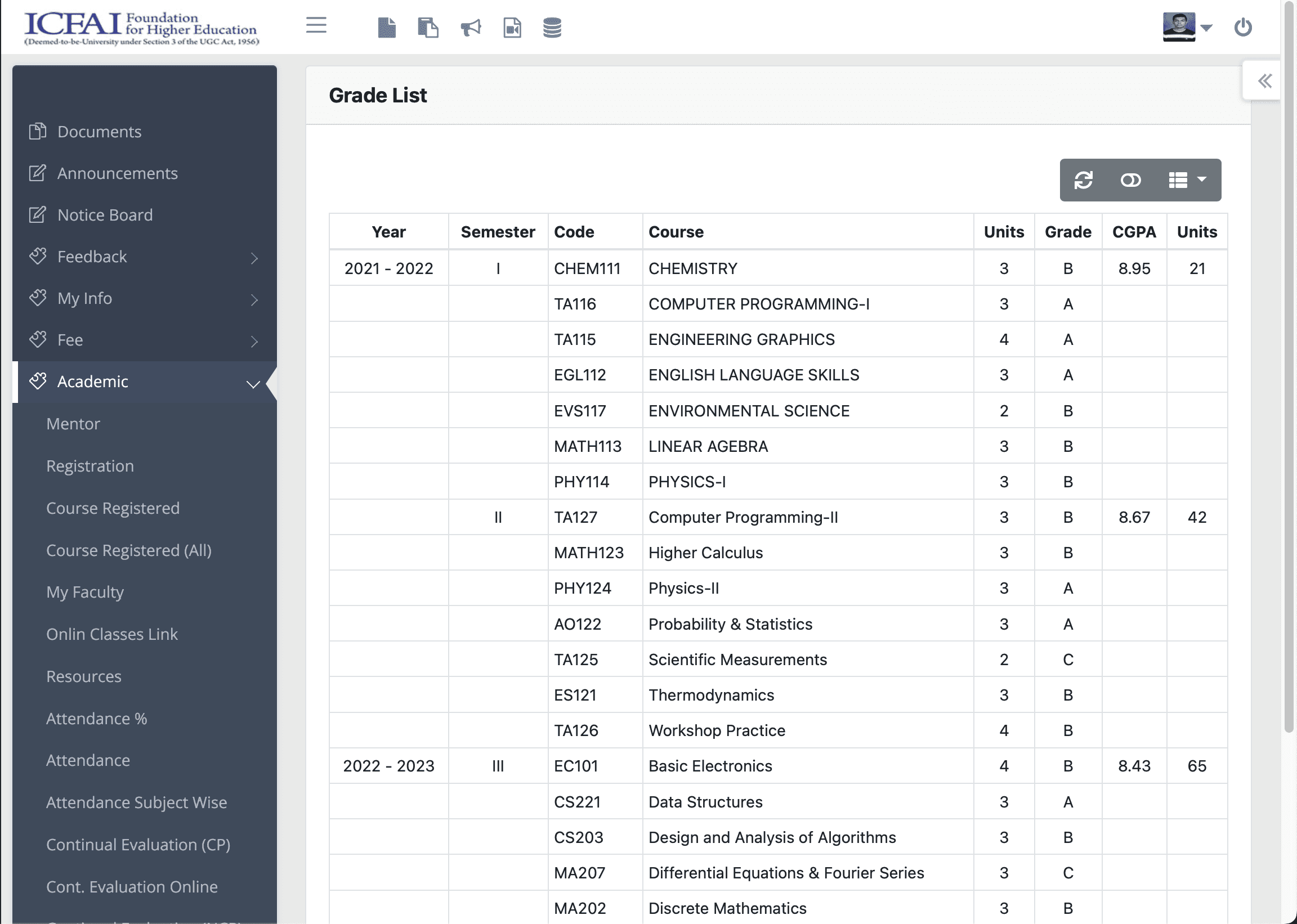
Grades Screen
Before
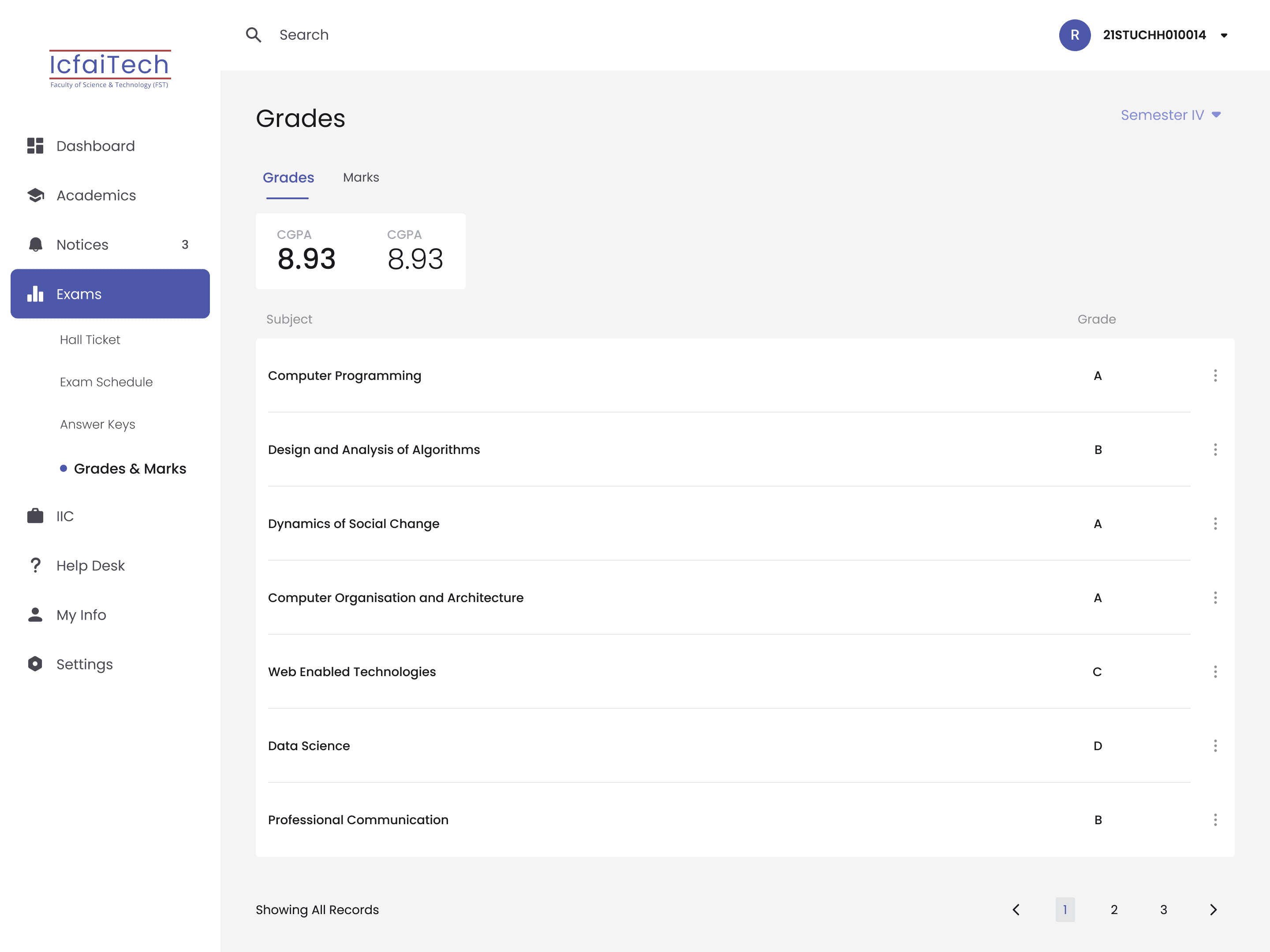
Grades Screen
After
Testing
After the design was finished, I took some help from some of my friends and asked them to use the web portal as they normally would to do the tasks they usually do. They were able to perform the tasks with easy and were happy to use the web portal with the new design
Dribble
Behance
Youtube
Designed, developed and all rights reserved by Aimann Shaik © 2023